When I say user friendly, I'm talking about something to the terms...Put your grandma in front of the computer and tech her how to use the computer, then tell her to use your software"
You're going to teach her about the Start menu, about the menu and the fact that there will always be File, Edit, View, Help in this order (you have File, View, Tools, ? when you could have Edit to cut or delete files in the queue), so if she wants to save a document she must go to a menu that works with files titled (obviously) "File" and so on, that the Next button should always be on the right of the Previous button, that dialogues should have OK and Cancel and not Cancel and OK on them, that the interface should be easy to use by color blind or people that have to use screen readers because they're legally blind (think for a minute what would a screen reader do when your app will extract all those files in the background for a minute and will keep repeating "extracting lame dot exe dot dot dot new line extracting file : wget dot exe dot dot dot new line...)
Then you have the about window that I already told you about that pops with a scary grawl and is filled with a text that doesn't mean anything aka no legal value (because it's not the full GPL license, a simple scroll bar would fix the problem), the X button in the top corner doesn't work, the Accept button (aka Positive action from the user ) is in the middle while on the main form the positive action is on the left corner (Encode now) and the About button (the most useless because it's also in the ? menu) is in the middle, the center of the action) and so on...
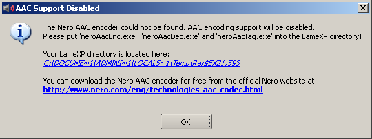
And by the way... if i decline the license once, I can't use the application ever? Maybe I change my mind. Now I can't run it the second time. And it shouldn't close just because I decline the license - the harm was already done, I've already launched the application even though I haven't actually "used" it. I have to edit C:\Documents and Settings\Administrator\Local Settings\Application Data\LoRd_MuldeR\LameXP - Audio Encoder Front-End\config.ini manually to remove that and make it working again (and you're using "Mulder" in registry and Lord_Mulder in app data)
Maybe the better word would be "intuitive"...
Why the DOS path style?
Why popup with OK saying i don't have WMA, and then a second popup asking if I want to download and install... couldn't it be done in one step... The initial auto update was something like "Search for update" and "Postpone", this one is "Download & install " and "Cancel" ... why not "Postpone" to mantain consistency? Cancel would make me think the application would terminate.
"Goto" Home folder ... goto is not a word.... "Save output ... " is too long to read and complicated... in Meta Data Edit, the positive action, should be on the left of Reset which is sort of a Cancel or undo... checkboxes with [x] don't exist on Windows and confuse user who will think when checked it means "don't do it"...
Compression page shows quality/bitrate min and max, but going toward min increased the quality level which doesn't make sense to a user that doesn't know technology behind - the advanced option gets it right keeping it to Low quality, average, high quality, best etc
\ and / inconsistency ... and Output dir tab shows path with \ but the source files shows files with / in the panel (I know Windows treats / and \ the same but a Windows user may be puzzled by this /)...
Then all the frills of the QT like blue bars around text boxes, making a dotted rectangle around the buttons that are default (the OK for example if it's the only button on dialogue)... it all makes the interface "bad" for regular users...